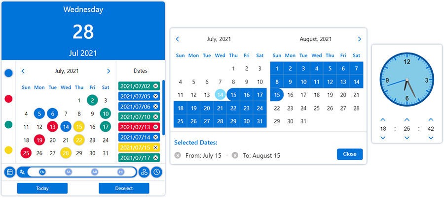
| value |
Date,
DateObject
, String, Number or Array
|
new Date() |
both |
| ref |
React.RefObject |
|
both |
| multiple |
Boolean |
false (true if value is Array) |
both |
| range |
Boolean |
false |
both |
| onlyMonthPicker |
Boolean |
false |
both |
| onlyYearPicker |
Boolean |
false |
both |
| format |
String |
YYYY/MM/DD |
both |
| formattingIgnoreList |
Array |
|
both |
| calendar |
Object |
gregorian |
both |
| locale |
Object |
gregorian_en |
both |
| mapDays |
Function |
|
both |
| onChange |
Function |
|
both |
| onOpen |
Function |
|
DatePicker |
| onClose |
Function |
|
DatePicker |
| onPropsChange |
Function |
|
both |
| onMonthChange |
Function |
|
both |
| onYearChange |
Function |
|
both |
| onFocusedDateChange |
Function |
|
both |
| onPositionChange |
Function |
|
DatePicker |
| digits |
Array |
|
both |
| weekDays |
Array |
|
both |
| months |
Array |
|
both |
| showOtherDays |
Boolean |
false |
both |
| minDate |
Date, DateObject, String or Number |
|
both |
| maxDate |
Date, DateObject, String or Number |
|
both |
| disableYearPicker |
Boolean |
false |
both |
| disableMonthPicker |
Boolean |
false |
both |
| disableDayPicker |
Boolean |
false |
both |
| zIndex |
Number |
100 |
both |
| plugins |
Array |
[] |
both |
| sort |
Boolean |
false |
both |
| numberOfMonths |
Number |
1 |
both |
| currentDate |
DateObject |
|
both |
| buttons |
Boolean |
true |
both |
| renderButton |
React.ReactElement or Function |
|
both |
| weekStartDayIndex |
Number |
|
both |
| className |
String |
|
both |
| readOnly |
Boolean |
false |
both |
| disabled |
Boolean |
false |
both |
| hideMonth |
Boolean |
false |
both |
| hideYear |
Boolean |
false |
both |
| hideWeekDays |
Boolean |
false |
both |
| shadow |
Boolean |
true |
both |
| fullYear |
Boolean |
false |
both |
| displayWeekNumbers |
Boolean |
false |
both |
| weekNumber |
String |
|
both |
| weekPicker |
Boolean |
false |
both |
| containerClassName |
String |
|
DatePicker |
| arrowClassName |
String |
0 |
DatePicker |
| style |
React.CSSProperties |
{} |
DatePicker |
| containerStyle |
React.CSSProperties |
|
DatePicker |
| arrowStyle |
React.CSSProperties |
0 |
DatePicker |
| arrow |
Boolean or React.ReactElement |
true |
DatePicker |
| animations |
Array |
false |
DatePicker |
| inputClass |
String |
|
DatePicker |
| name |
String |
|
DatePicker |
| id |
String |
|
DatePicker |
| title |
String |
|
DatePicker |
| required |
Boolean |
|
DatePicker |
| placeholder |
String |
|
DatePicker |
| render |
React.ReactElement or Function |
|
DatePicker |
| inputMode |
String |
|
DatePicker |
| scrollSensitive |
Boolean |
true |
DatePicker |
| hideOnScroll |
Boolean |
false |
DatePicker |
| calendarPosition |
String |
"bottom-left" |
DatePicker |
| editable |
Boolean |
true |
DatePicker |
| onlyShowInRangeDates |
Boolean |
true |
DatePicker |
| fixMainPosition |
Boolean |
false |
DatePicker |
| fixRelativePosition |
Boolean |
false |
DatePicker |
| offsetY |
Number |
0 |
DatePicker |
| offsetX |
Number |
0 |
DatePicker |
| mobileLabels |
Object |
|
DatePicker |
| portal |
Boolean |
|
DatePicker |
| portalTarget |
HTMLElement |
|
DatePicker |
| onOpenPickNewDate |
Boolean |
true |
DatePicker |


